
The matter of color is a very important element for designers for both print media and online media. There are big systems that you should know how to use (RGB vs CMYK).
That is, in addition to graphic designers having to know how to use colors, tones, and gradients, they also have to know the techniques for which colors should be used together. should be contrasted Or which color is forbidden? They should absolutely not be used together. To make the work that comes out look beautiful, eye-catching, and pleasing to the customers, and another important thing that What new designers need to know is the two main color modes used in online media and the color modes used in printing systems (offset, inkjet, digital) are different color systems. Today we will take you to get to know the RGB and CMYK color systems, including how to choose them to suit different design tasks.
- RGB
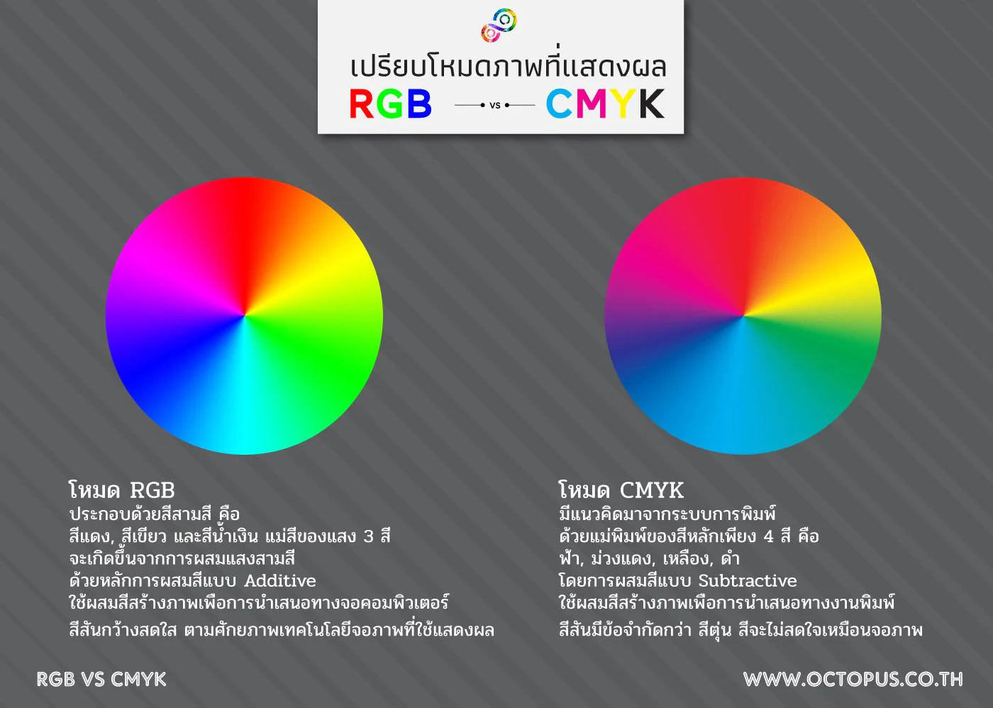
- Primary colors and color combinations RGB color has 3 main colors : red, green, and blue. The principle of color mixing is additive color mixing, which is adding other colors until new colors are created that are displayed for us to see on the monitor screen. When mixing colors and grading the brightness of colors with the miniaturizer screen, there will be a total of 16,777,216 colors to choose from.
- Advantages and disadvantages RGB color is a color that can be easily chosen, especially when designing for display on a computer screen. The file can be saved to use on the website immediately and the file can be converted to CMYK for printed media, posters , and flyers , but the colors will be distorted. And the quality is not as good as it should be because RGB files are often reduced to small files that can be displayed quickly on the screen. But it's often not detailed enough. for use in inkjet printing Large sign printing work
- Usage The RGB color system is a color system that is suitable for use in various online and digital media, including media used to present on monitor screens, television screens, smartphones, both via the internet, websites, or saved files in format. of CD and DVD files
- CMYK
- Primary colors and color combinations CMYK color is a color system that consists of 4 primary colors : cyan, magenta, yellow (yellow), and black (black). Mixing colors is a subtractive mix. is the absorption of light reflected from an object. Some of the color will be absorbed. and some colors will be reflected When the color gradient is completed by the printer's pigment dots, there will be a total of 1 million colors to choose from, in percentages from 0-100 , from white to black.
- Advantages and disadvantages It is a high contrast color especially suitable for printing. And designs are sent to various printers, but the paper used for printing must be selected appropriately. Otherwise, the resulting color will be opaque and not as beautiful as it should be. Including this type of printer ink is quite expensive.
- Usage The CMYK color system is a color system suitable for printing , including posters , flyers , vinyl signs , billboards, magazines , business cards, leaflets, brochures, and various types of printed media.
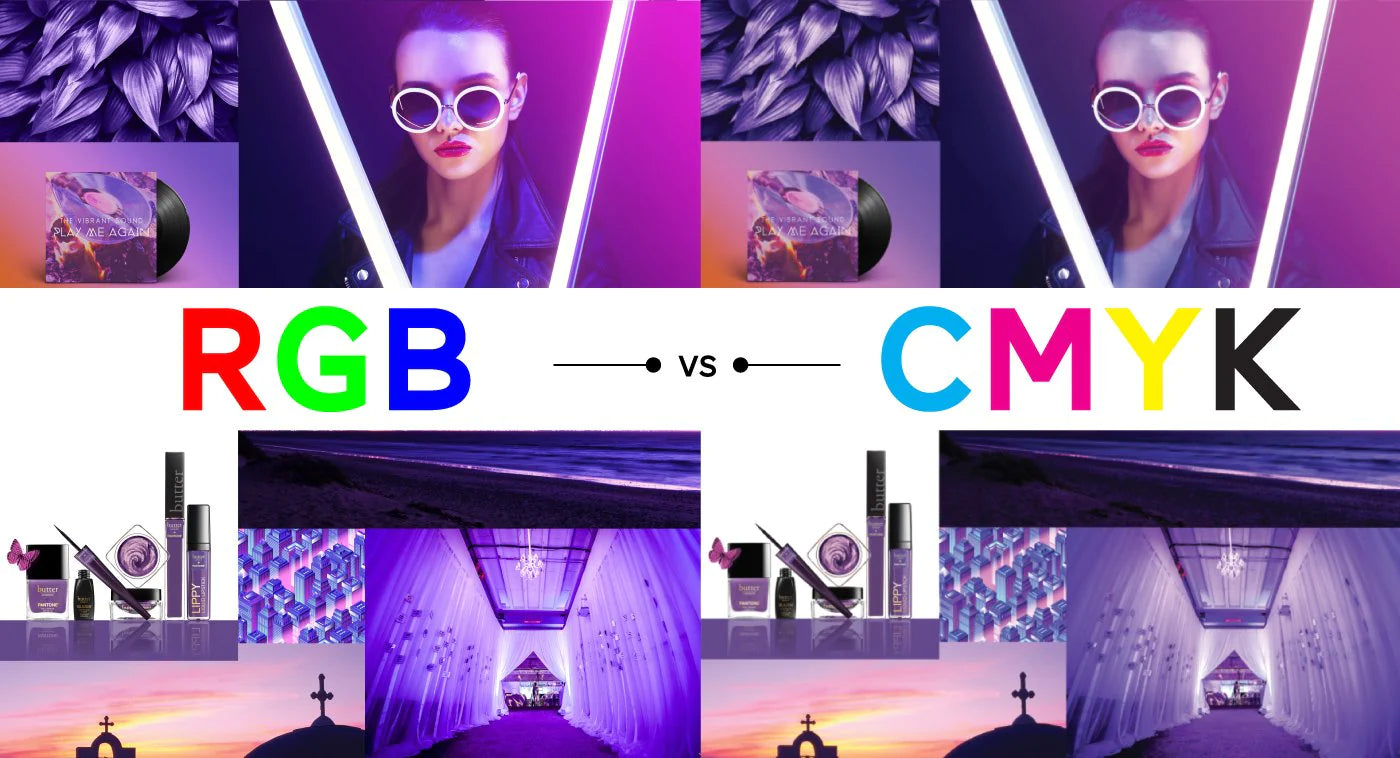
When seen comparing the same picture left and right It can be seen that the bright colors are displayed well when we choose to use RGB Mode. The color on the right, which is CMYK, is displayed as close to the reality of the print as possible.
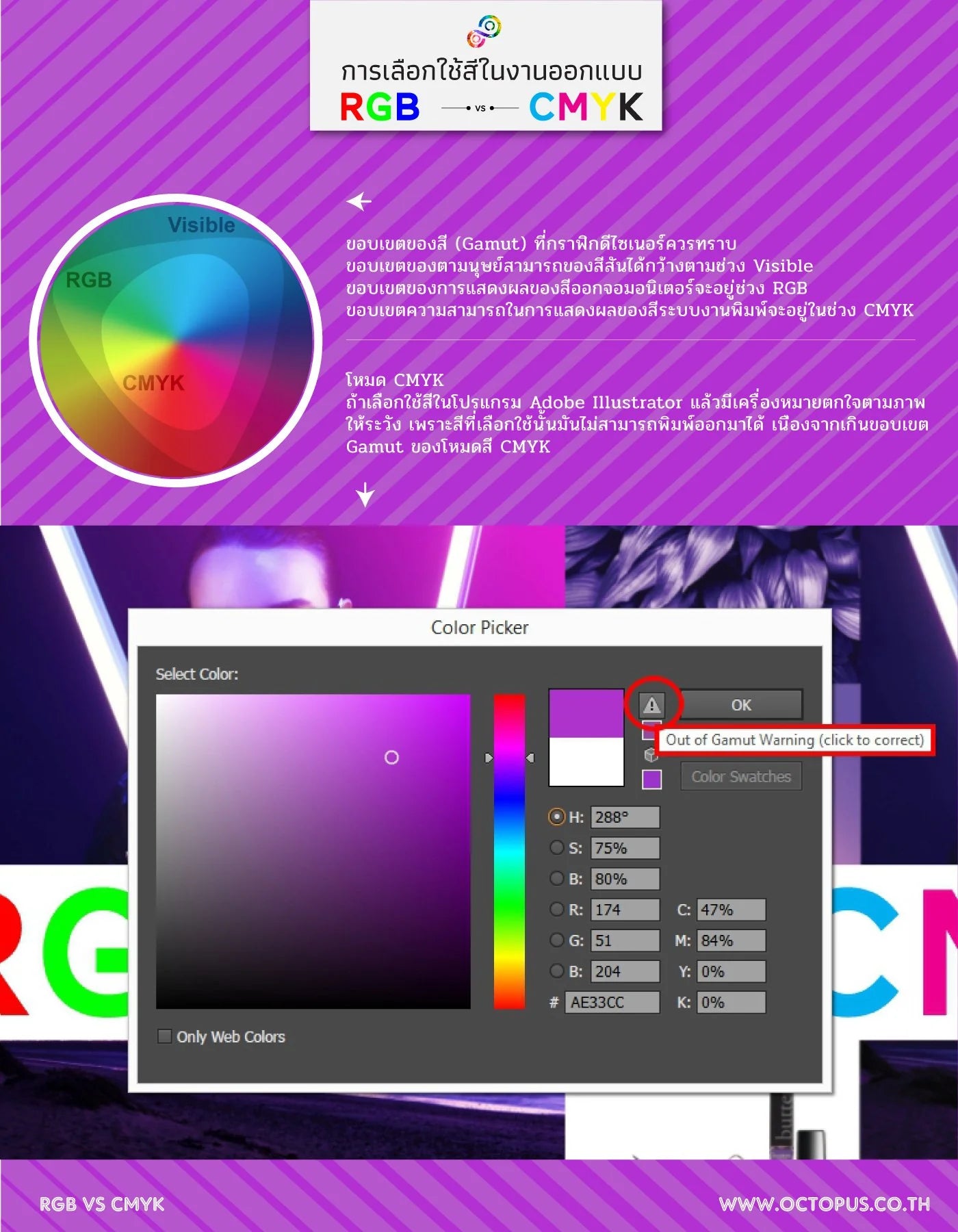
Especially when we are working in CMYK mode, we may have to be more careful with our color selection. Because otherwise we might be using colors that aren't actually printable. When looking at the screen, our artwork may look beautiful, but why does the print look dull and distorted? That's because we haven't looked at the range of printable colors well enough (CMYK Gamut). In Illustrator, Photoshop already has a function to warn about Gamut, which we can use to help us.

In summary, RGB mode is suitable for graphics, banner design, and display on computer screens and mobile phones, with an emphasis on small, concise files with beautiful, bright colors. Use a resolution of 72 DPI and above to save files as JPEG, PNG, GIF, smallest file PDF in small sizes so that loading does not waste internet costs and loads quickly.
As for CMYK mode, it is suitable for making graphics for display through printing. Emphasis is placed on large, detailed, sharp files with colors consistent with the specified profile. Use a resolution of 300DPI or higher. Save large AI, PSD, EPS, TIF, Highest Quality PDF files without compromising quality. In order to make the details of the banner come out as complete as possible.
If we use them interchangeably The file for viewing on the screen will be large and heavy and the color is dull and unattractive. The printed file will be distorted and discolored.
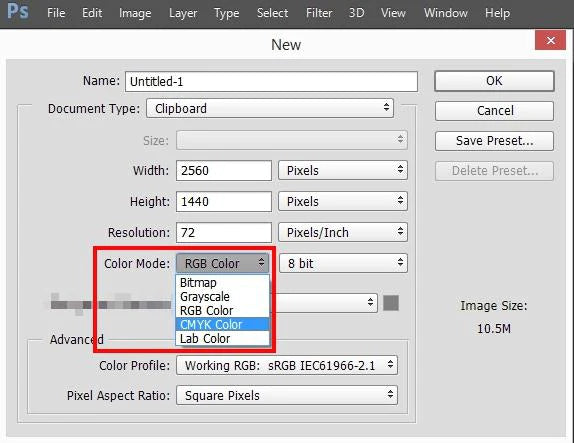
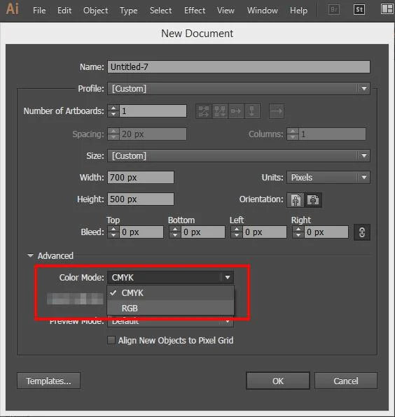
Therefore, once you know the differences between the two color systems, it is believed that designers will know how to choose a color system to suit the job and close the final work more easily. In particular, designers of artwork for printing posters, flyers, vinyl signs that need to be sent to a printing house should set the colors to the CMYK system from the beginning to prevent color distortion and to get high quality work that pleases the customer . How to set Set when opening a new file in Adobe Photoshop or Adobe Illustrator, select the correct mode from Properties as shown in the picture.
In addition, for those who produce prints that have a lot of black elements in their designed artwork, It is recommended to be very careful to prevent black distortion problems. Read more.

Get graphic design Check and edit your work files to make the colors bright, clear and beautiful. We can take care of both Digital Ad (RGB) and Print Ad (CMYK) work. Contact Octopus Media Solutions Company. You can be confident in us because it is. "Your Marketing Team" 081-776-8329 or LINE ID: @OctopusDesign
Follow and see the work of each department of our company at fb.com/OctopusMediaSolutions