

Corporate Identity (CI) — What Is It?
What Designers and Marketers Need to Know
In today's highly competitive market, your brand identity is the first thing that makes customers remember and trust you — CI isn't just a logo, it's the entire system of thinking behind your organization.
- What Is Corporate Identity (CI)? — Definition and meaning
- Core Elements of CI — Logo, Typography, Color
- Why Does Every Business Need CI? — Value to your organization
- What Does a Good Brand Guideline Look Like — World-class examples
- Case Study: Bangkok's CI — By Farmgroup
- How Octopus Can Help — Full-service design and production
What Is Corporate Identity (CI)?
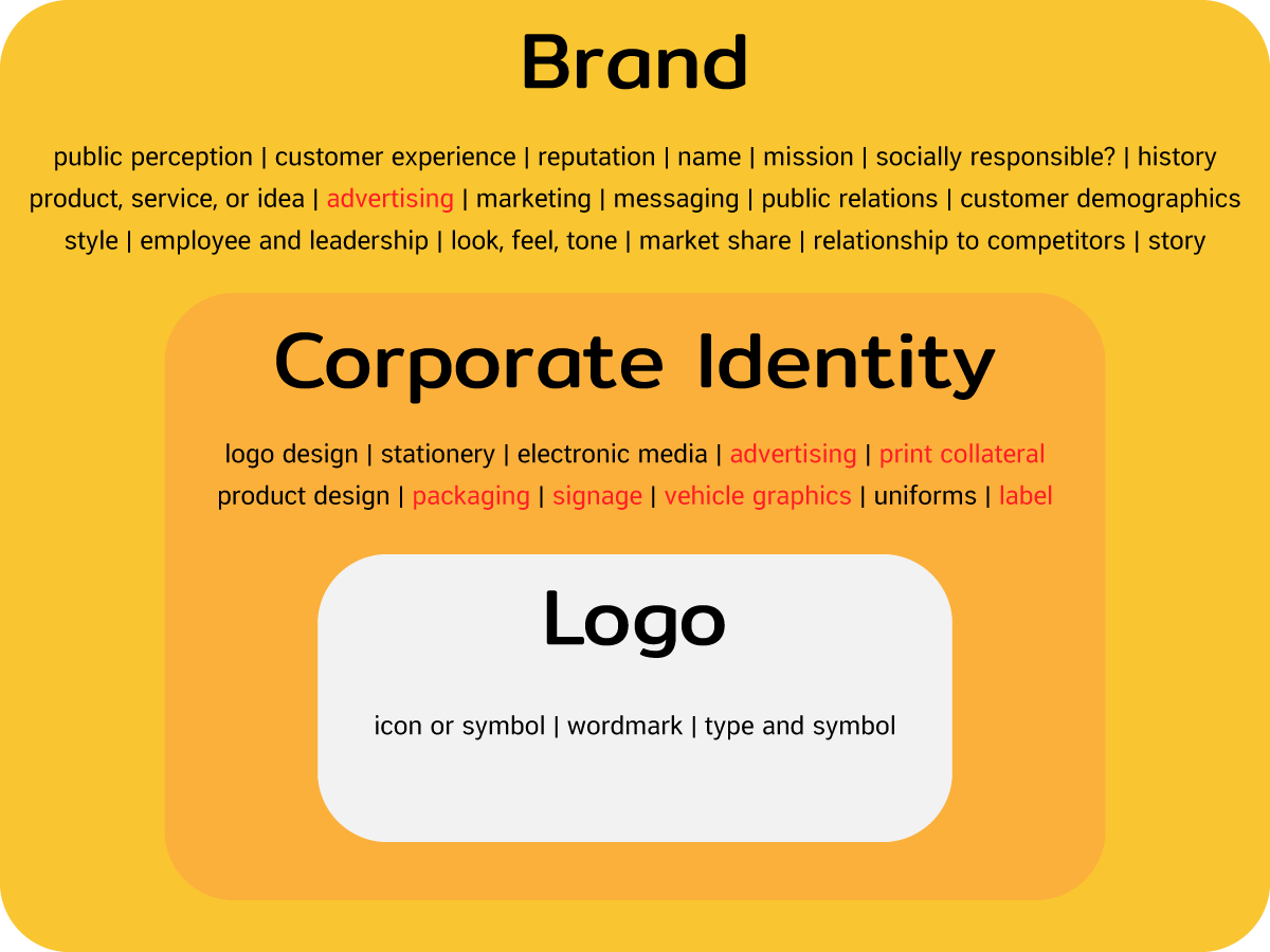
Corporate Identity, or CI, is the design of an identity system that makes a brand's character memorable to consumers. Customers can instantly recognize a brand's image, thinking, and style just by looking at it.
Think of it like the traits that make a person recognizable — their build, face, personality, taste, and preferences. A brand works the same way: it has a clear identity that's communicated through its CI system.
CI isn't just a logo — it's the entire system that makes a brand "speak the same language" across every touchpoint, from business cards to storefront signage.— Octopus Media Solutions
Core Elements of Corporate Identity
The core principles for designing a company or brand's identity start with these three elements:
Logo
A symbol or design that uses imagery, color, or type to communicate a brand or organization's unique identity — the first thing customers remember.
Typography
The fonts or typefaces used in a design — typically 2–3 fonts, with type and size depending on the kind of message being communicated.
Color
The element that helps customers recognize a brand's logo more easily. Different color choices evoke distinctly different feelings.
Why Does Every Business Need Corporate Identity?
Amid heavy competition in today's market, building an identity or brand — having a Corporate Identity — lets the public and customers clearly recognize who you are and creates lasting recall, making your business stand out from competitors.
Applying CI in practice can include graphic design, vinyl banners, company signage, acrylic signs, car wrap stickers, illuminated channel-letter signs, printed media, and even event exhibition booths — every touchpoint with your brand needs to reflect the same CI.
What Does a Good Brand Guideline Look Like?
A good Brand Book or Brand Guideline creates clarity in how a Corporate Identity is applied and ensures consistent brand communication. Here are examples from world-class organizations:
BRAND
GUIDELINE
Examples
Case Study: Bangkok's Corporate Identity
One of the most compelling case studies for CI at a government-organization level is the rebranding of the Bangkok Metropolitan Administration (BMA) emblem, led by the Farmgroup team.
The Bangkok Metropolitan Administration Emblem
Rebranded by Farmgroup
The BMA emblem rebrand process is a strong example of doing CI the right way — studying the original artwork, understanding its history, then recreating it to suit the current era.
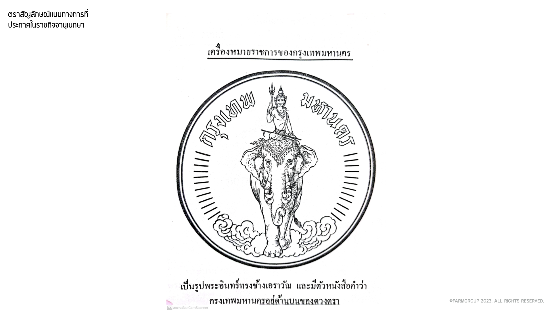
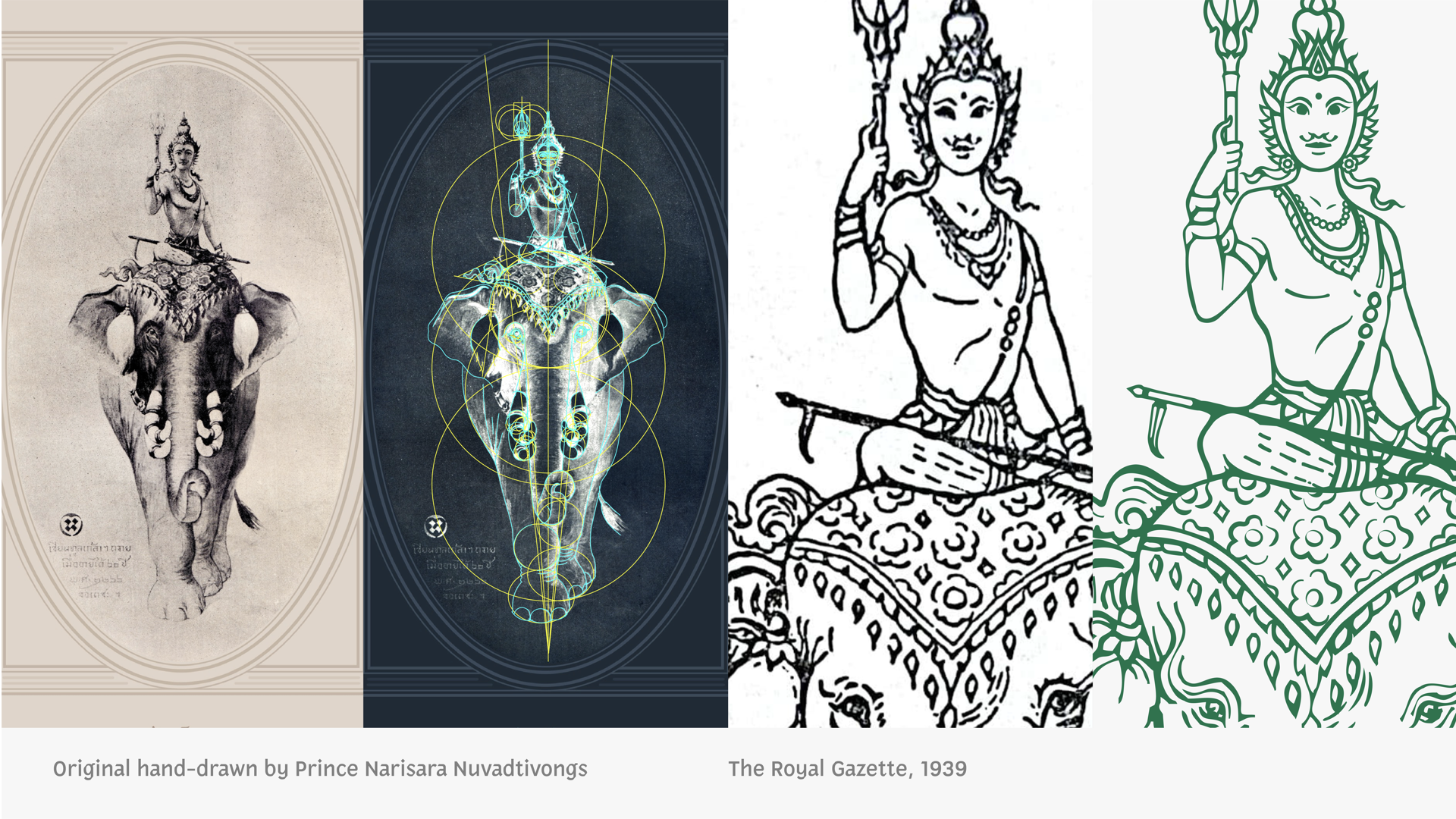
"The only original logo that exists is held at the National Archives — just an image on paper that's aged over time, with low clarity. Redoing the logo was like re-photographing the original with a sharper, newer camera."— The Farmgroup team behind the rebrand
Timeline of the Rebrand
The original logo is kept at the National Archives — an aged image on paper with low clarity, and no reliable digital file existed.
The original logo was drawn by HRH Prince Narisara Nuvadtivongs as a gift to King Vajiravudh (Rama VI).
This caused some ornamental details to drift from the original. The agreement with the BMA was to match the Government Gazette artwork as closely as possible.
The team used the original drawing held at the Wang Klong Toey Museum, along with the emblem drawn by the Fine Arts Department at the National Archives, as references for the recreation.

Letterforms from the original logo were compared against the proportion-adjusted version to ensure accuracy and visual balance.
The Identity Typeface: "Sao Chingcha"
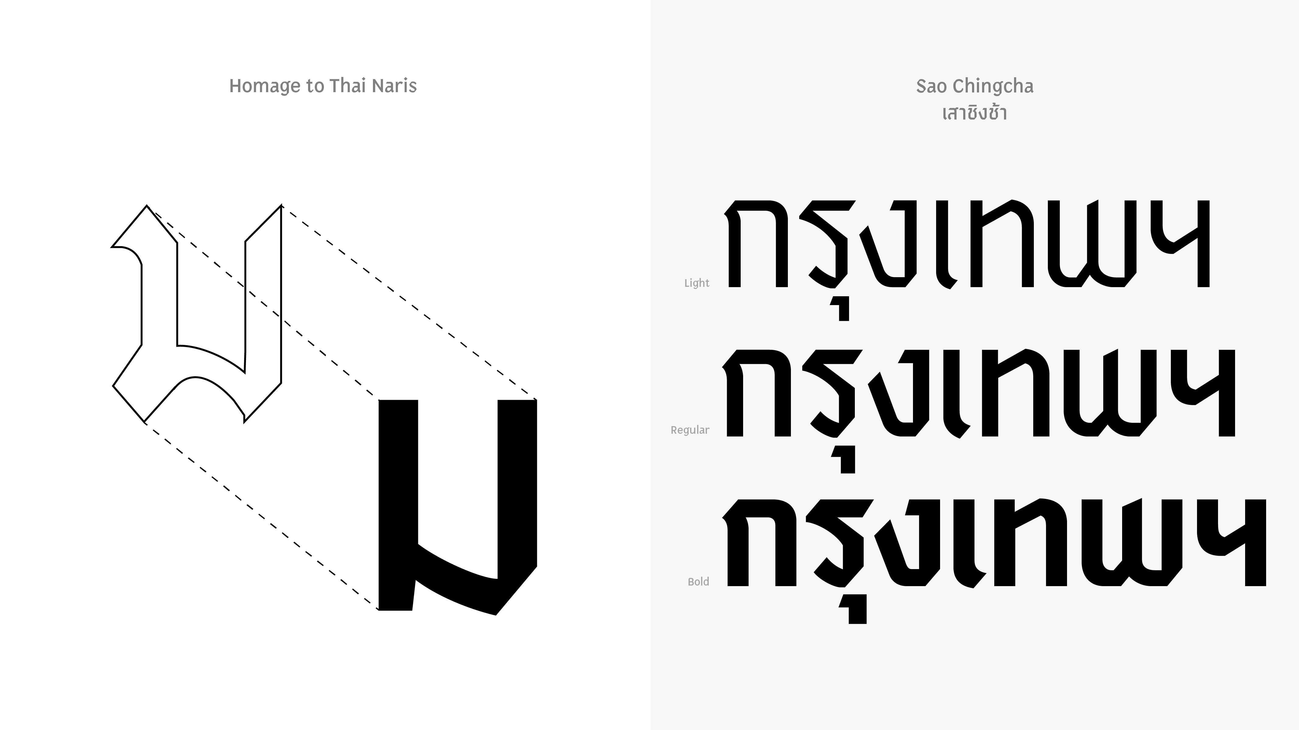
From the "Naris" script to the identity typeface "Sao Chingcha" — the Farmgroup team designed BMA's signature typeface, named "Sao Chingcha" (Giant Swing), referencing the lettering of "Krung Thep" on the original emblem drawn by Prince Naris.
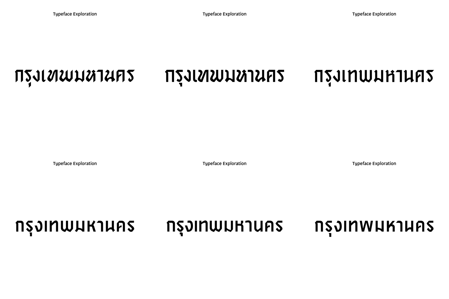

Font Weights — Sao Chingcha by Katatrad
Produced by the 'Katatrad' team, who developed the sketch designs into a complete typeface and handled the coding system.

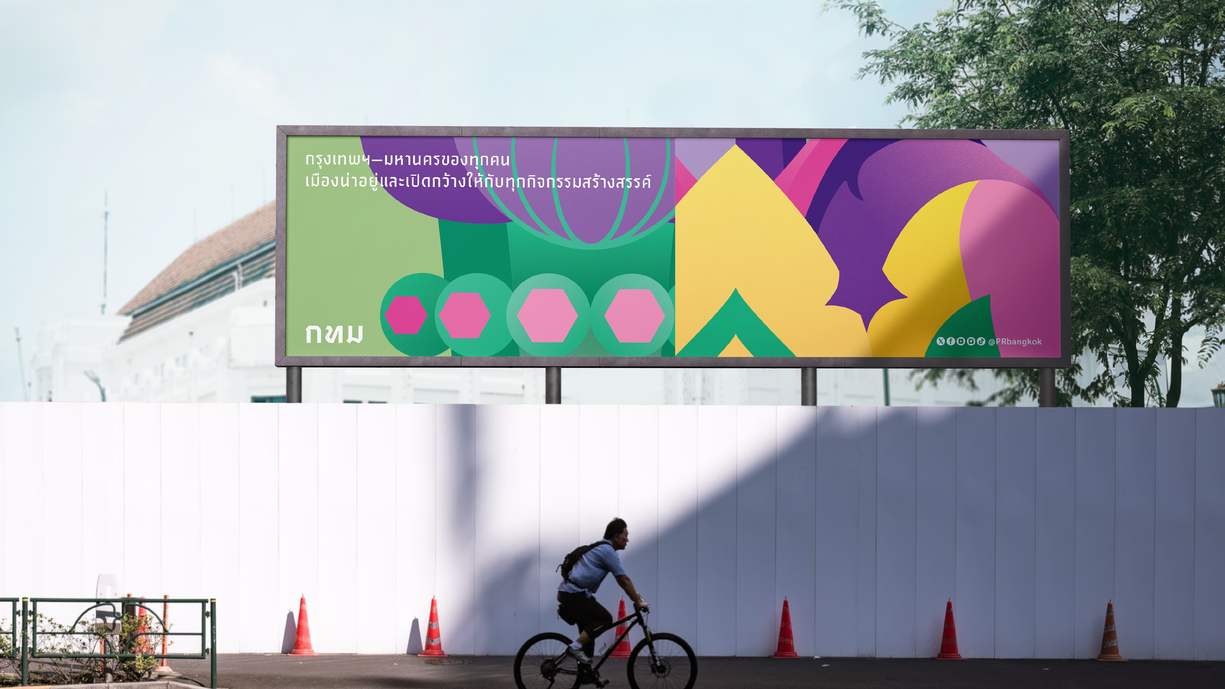

Create your own Bangkok sticker at
bkk-sticker.vercel.appWho Can Help Build Your Brand and Media to Match Your CI?
To add value to your business's marketing media and build a truly memorable brand, Octopus Media Solutions offers full-service advertising design and production — from concept through installation.
Octopus Builds Media That Matches Your CI
Channel-letter signs, acrylic, stainless steel, vinyl banners, stickers, event booths, printed media — every piece reflects your brand's Corporate Identity.